Development of A Financial Literacy Platform
Full cycle of UX research · Teamwork
OVERVIEW
👩🏻💻 My Role
Managed the research process, data analysis, and spearheading the design
Managed the research process, data analysis, and spearheading the design
👥 Work With
People from Psychology, Business & Engineering backgrounds
People from Psychology, Business & Engineering backgrounds
🛠 Tools
Figma, Sketch and Miro
Figma, Sketch and Miro
Introduction
CLIENT’S GOALS
Developing an idea to help students make better financial decisions
To better understand our client’s goal, the first thing I did was to deconstruct the client requirement:
Q1: What students should we focus on?

Q2: How to help them make decisions better?

CHALLENGES
Provide international students with the financial literacy they need
International students make up about 10% of the student body of UMD. Due to the changing living environment and social culture, these students are often faced with unfamiliar financial concepts and complex financial issues. These issues add additional stressors to international students and stop them from making informed financial decisions.
Our task was to help international students find ways to deal with these stressors and design a method to provide financial literacy for them.
Our task was to help international students find ways to deal with these stressors and design a method to provide financial literacy for them.
Outcomes
PRODUCT CONCEPT
FindaMentals
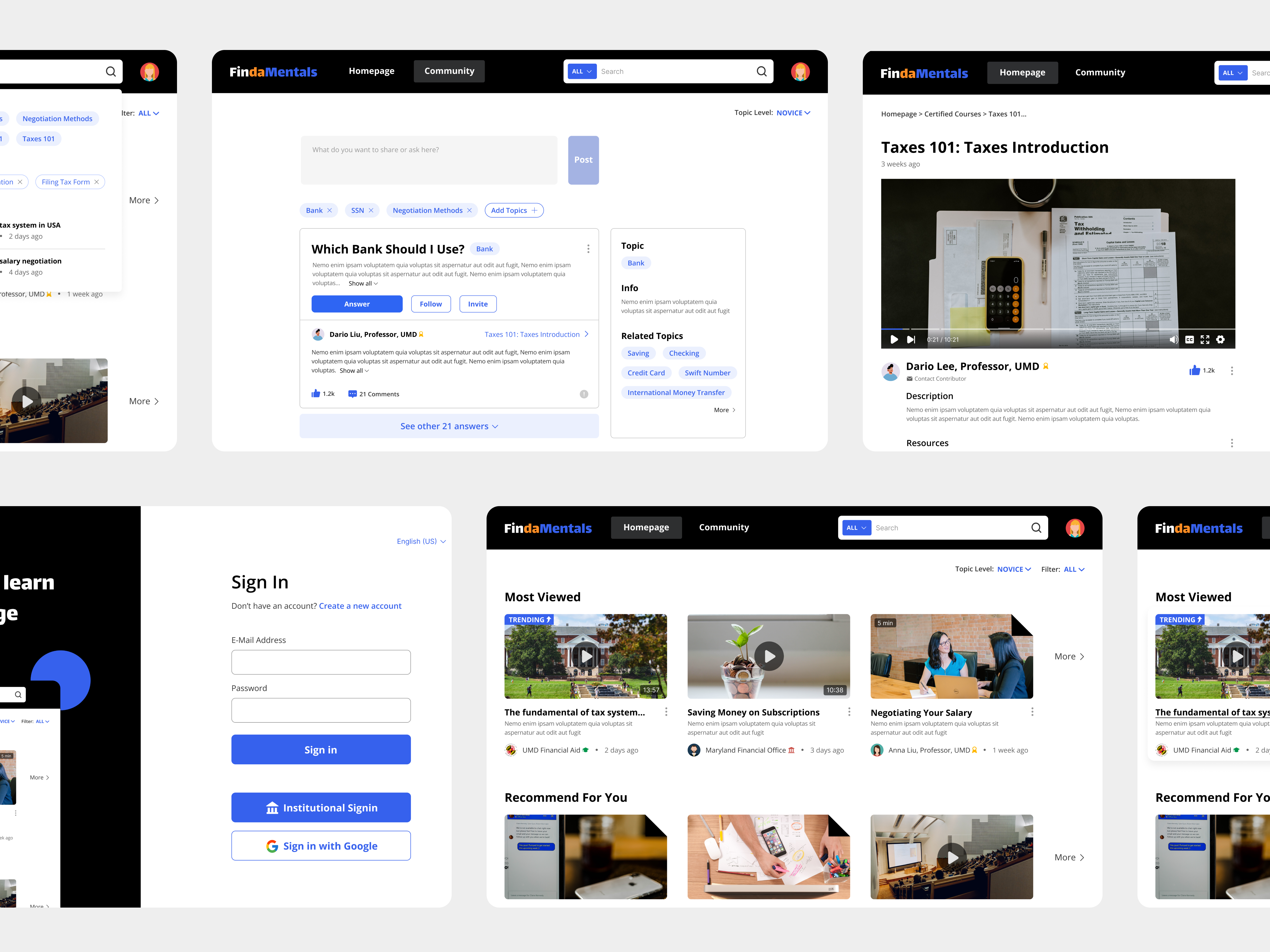
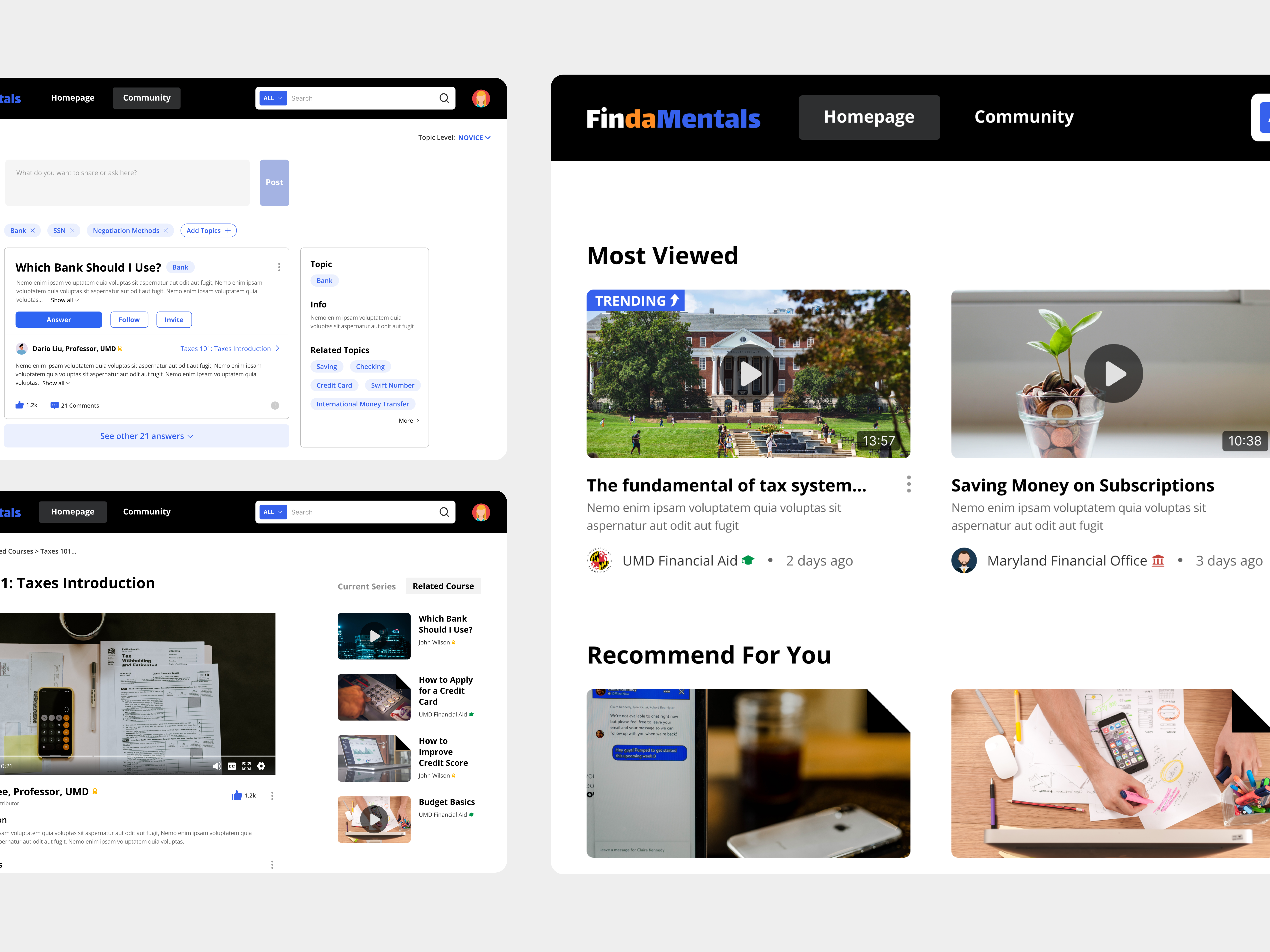
FindaMentals is a financial literacy toolkit. It facilitates international students resolve their financial inquiries through:
1. Integration of various financial resources
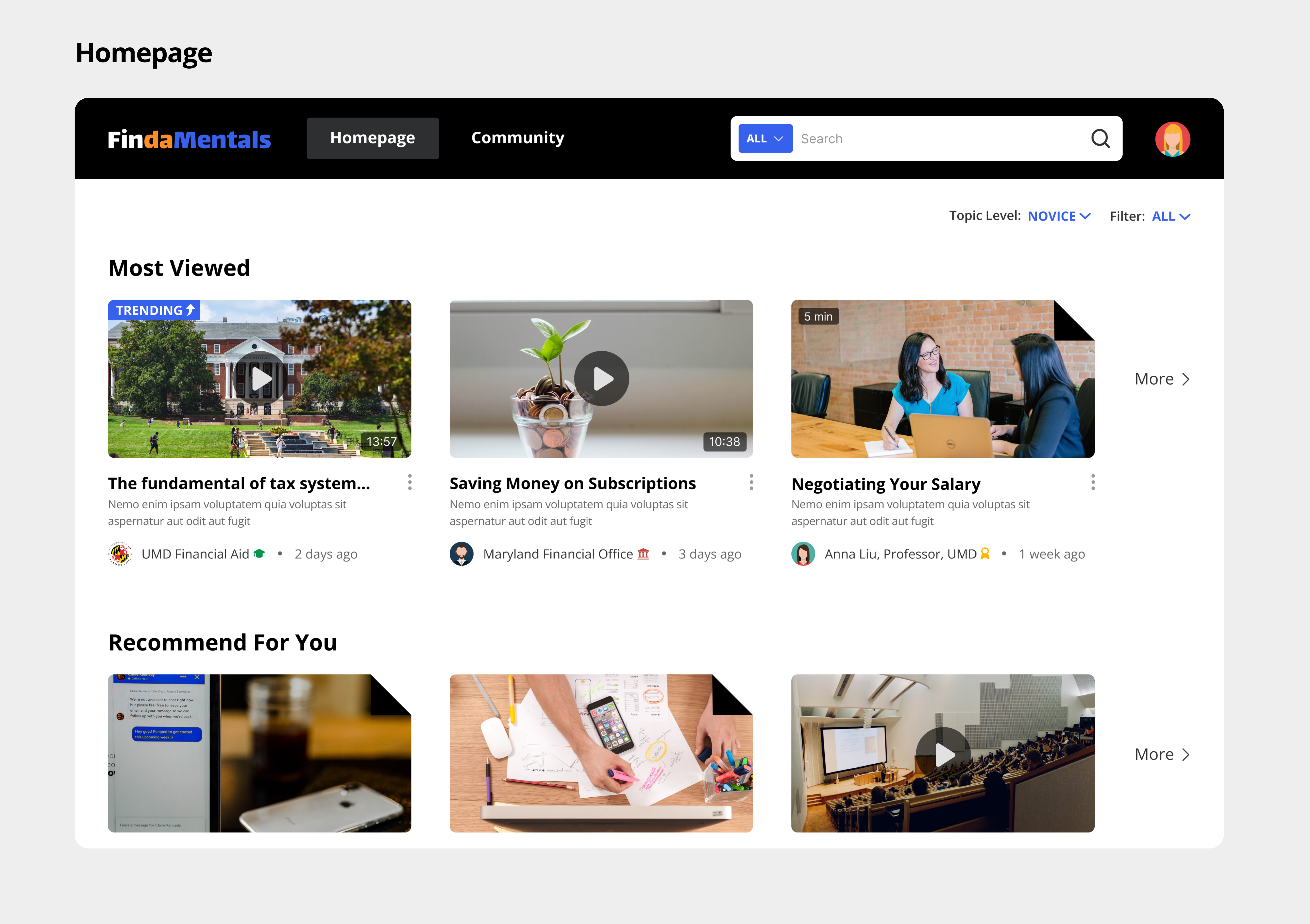
The website's homepage integrates financial literacy resources from different official sources. Users can browse the homepage to view the information they need or use the search function to find it quickly.
The website's homepage integrates financial literacy resources from different official sources. Users can browse the homepage to view the information they need or use the search function to find it quickly.
2. Real experience and authoritative answers
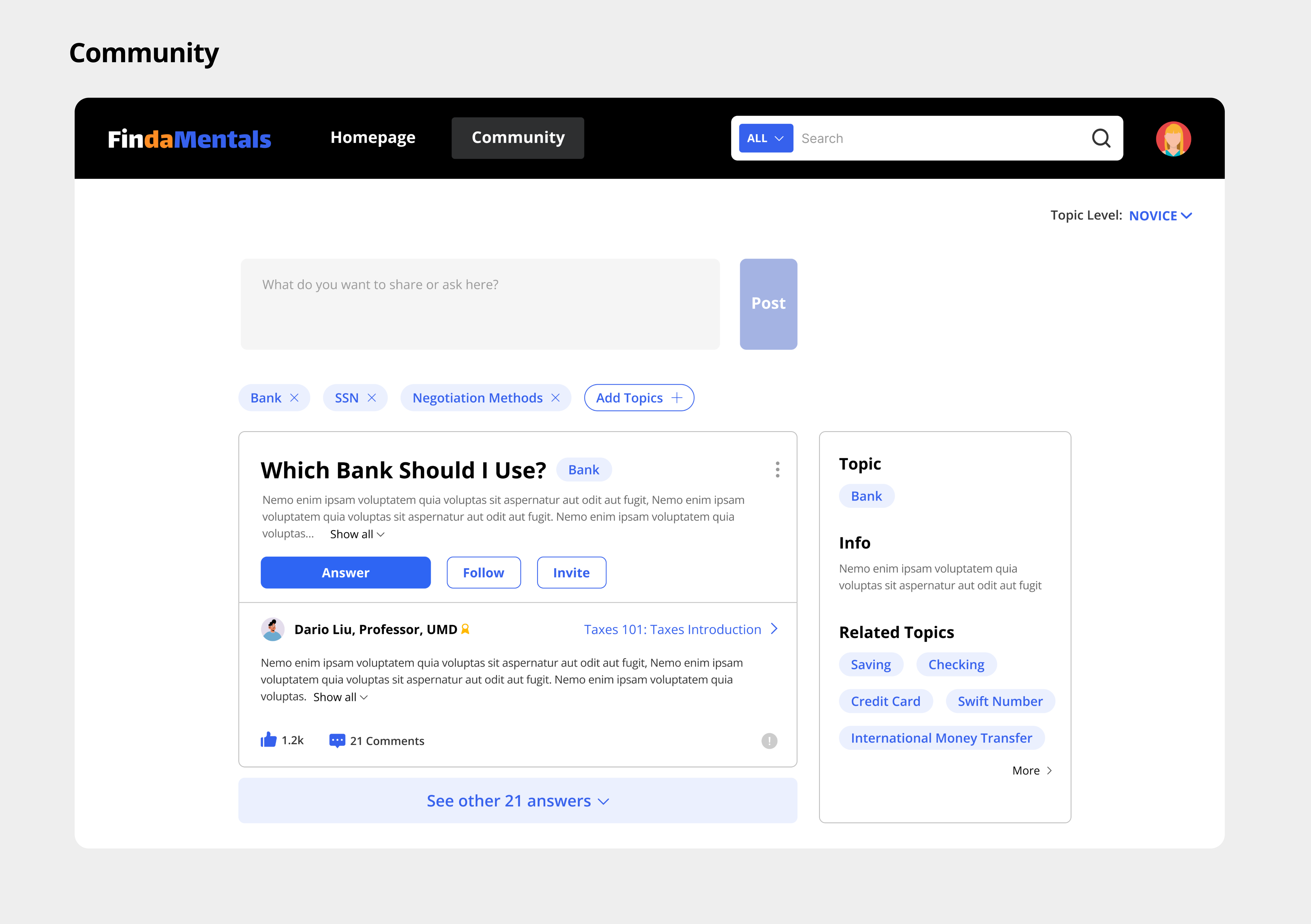
Users can view related questions and answers in the community section. They can also ask questions. Besides, answers from authenticated users will be displayed first so that users can get more trusted answers easily.
Users can view related questions and answers in the community section. They can also ask questions. Besides, answers from authenticated users will be displayed first so that users can get more trusted answers easily.
Research
PREPARATION
Design a user research
Problem Statement
The target audience of this project is international students in the U.S. Through some desk research, we found that this population faces many challenges because of the transition between different societies and environments. Based on this knowledge, we generated a problem statement:
What financial-related needs do international students care about when transitioning between countries, schools, and jobs?
Constraints & Requirements
Before starting the research, I listed all the limitations and their possible impacts on the study:
Limited time
We only have 4 weeks for the research and design process, so we have to focus on the high-priority aspects of the design.
Due to a limited budget, we may not provide much compensation to interviewees. So we have to choose the most suitable candidates.
Financial information is sensitive, so we need to use a research method that will not violate user privacy.
We only have 4 weeks for the research and design process, so we have to focus on the high-priority aspects of the design.
Limited bugets
Privacy issues
Financial information is sensitive, so we need to use a research method that will not violate user privacy.
Methods: Interviews
Based on the limitations, We used semi-structured interviews to elicit in-depth responses from participants. This format allows users to protect their privacy while revealing enough information for the research. Besides, it offered researchers the flexibility to ask follow-up questions as needed and enough guidance to ensure everything could be on track.
Interviewees
We decided on convenience sampling to find participants based on the limitations mentioned above. This is because we already have a good rapport with these people, so they will be more willing to share financial info with us.
When reaching out to potential interviewees, we aimed to find interviewees:
![]()
We hope to use these differences to find a more representative sample of respondents and thereby increase the credibility of the study.
When reaching out to potential interviewees, we aimed to find interviewees:

We hope to use these differences to find a more representative sample of respondents and thereby increase the credibility of the study.
Research
The process of our research was:
![]()

Questions
Interview Questions:

ANALYZE
Consolidate Data & Gain Insights
Affinity Diagram
After the interviews, our team held interpretation sessions to structure and consolidate the data we collected and presented it in the form of an affinity diagram:
This diagram helped us find answers to the question proposed before:
What financial-related needs do international students care about when transitioning between countries, schools, and jobs?
-
Need financial and emotional support from others
- Need low stress to feel confident
- Need trusted tools to organize finances
- Need to gradually learn practical financial skills
- Need to learn about finances in the US as transition
- Need to feel secure and stable
- Need to know financial and job situation well
After finishing the diagram, We created a sensation board and personas to consolidate our research results and provide references for the future design.
Sensation Board
Since the research results included many things about emotions and affective experiences, we used a sensation board to consolidate them.
![]()
Drawing on interviews, we identified 6 core affective goals for users of this finance toolkit. These core goals would be guidance for future design.
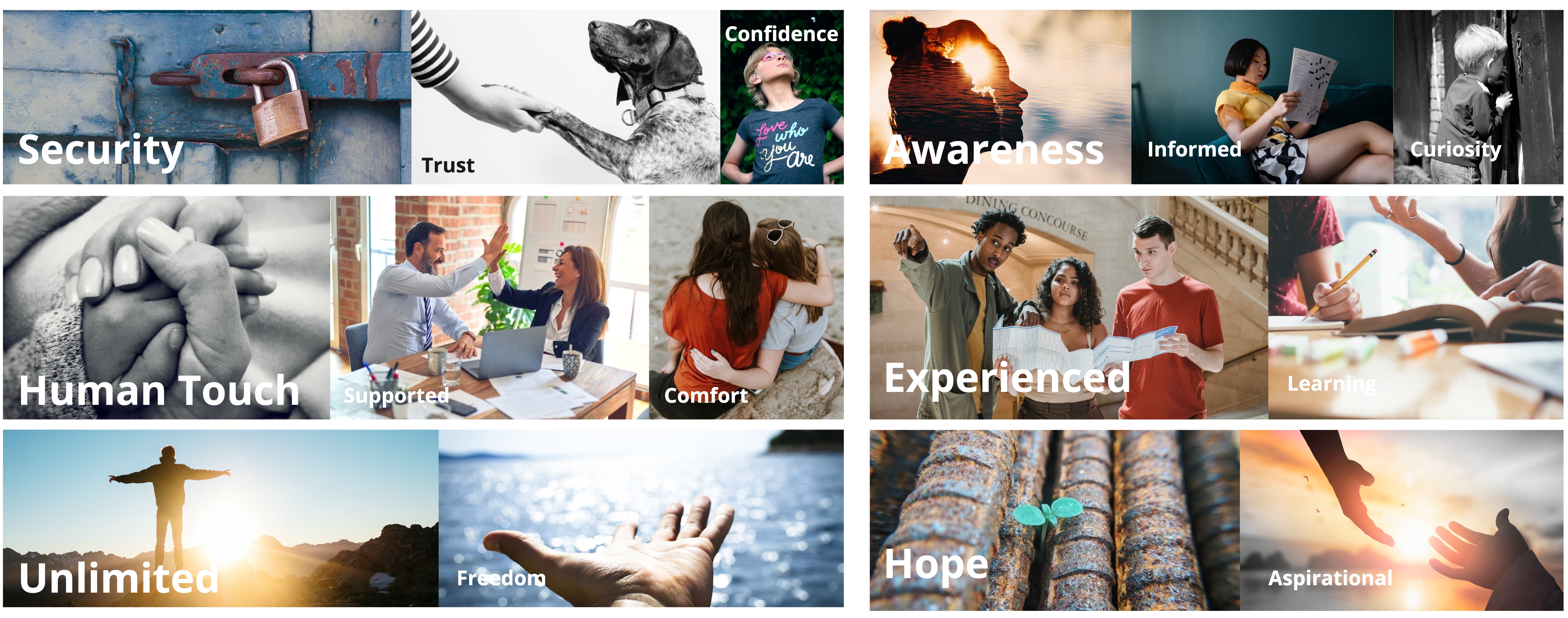
Drawing on interviews, we identified 6 core affective goals for users of this finance toolkit. These core goals would be guidance for future design.
Qualitative Personas
From interviews and conversations, we found that our population can be divided into 3 categories: Novice, Intermediate, and Advanced, and they have various goals and needs:
![]()
![]()
![]()
Slide to view other personas

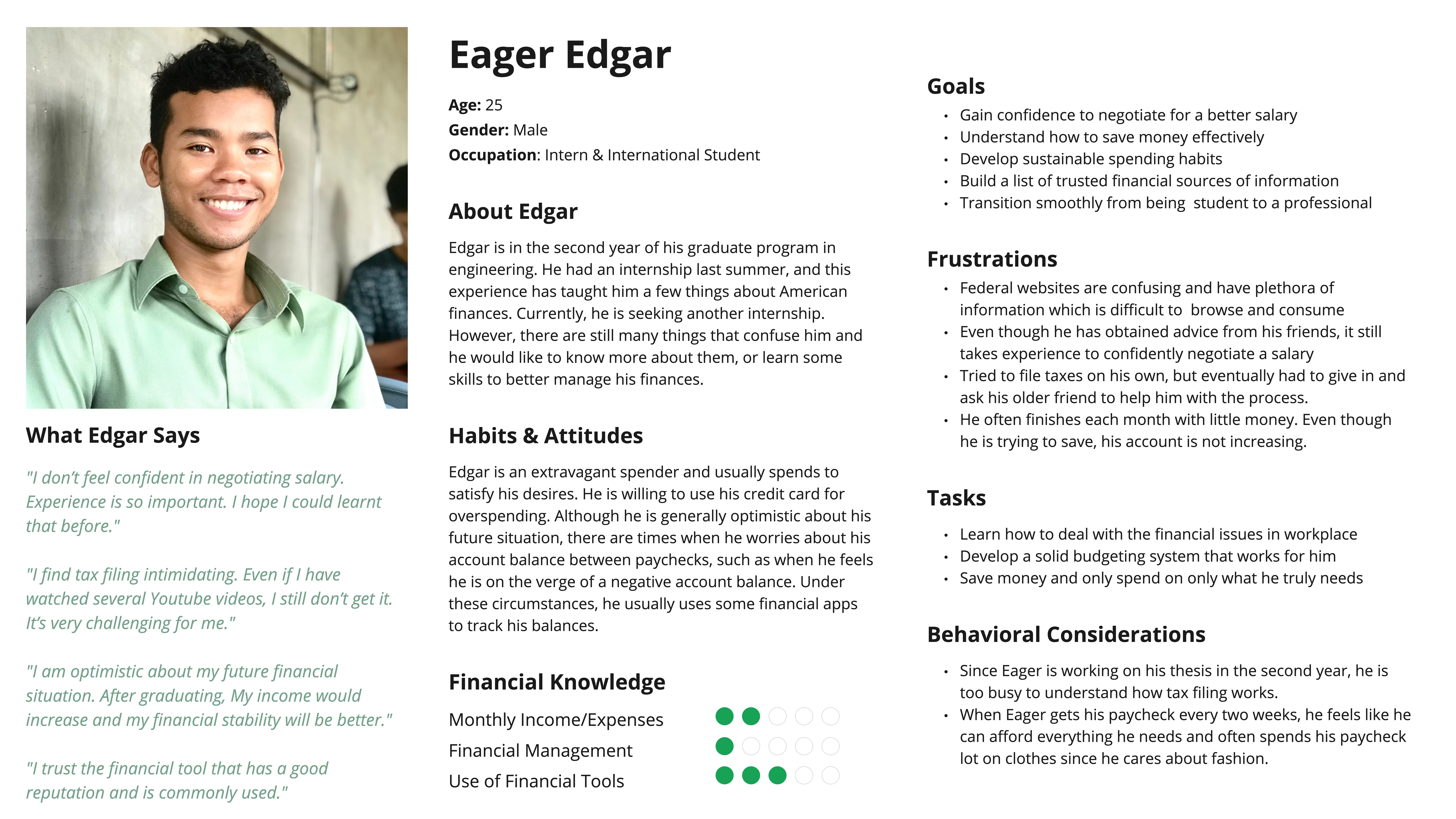
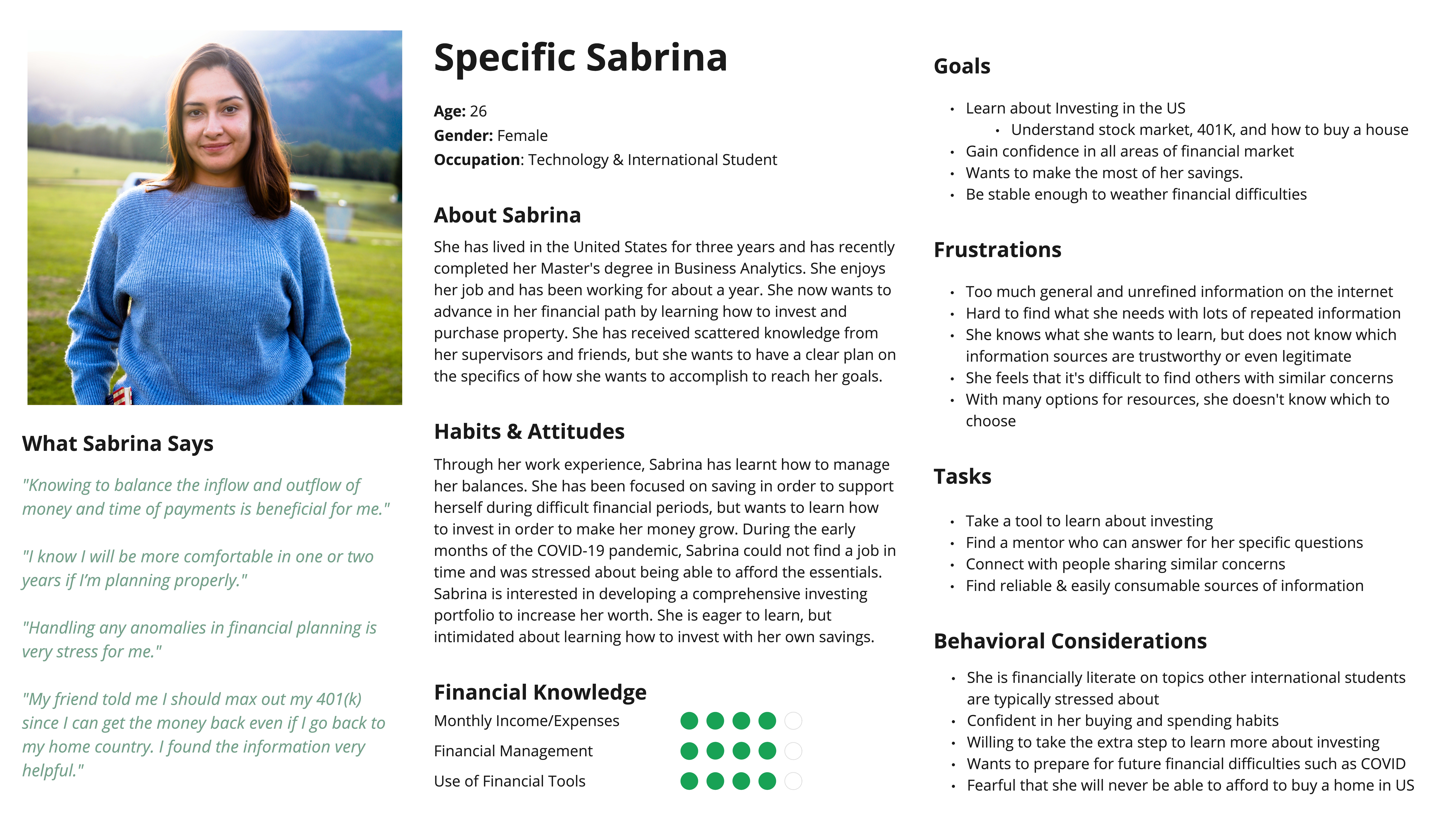
Slide to view other personas
Takeaways
Combined the conclusions from the affinity diagram and consolidation from the sensation board and personas, we generated these points:
International students are in different stages of grasping financial literacy. Thus their goals differ from each other:
International students need trusted support to organize their finances. This support is not only about providing resources but also about helping emotionally
International students hope that they can learn knowledge gradually with low stress.
Based on these points and opportunities, I proposed the HMW:
How might we use technology to help international students with various financial literacy and goals have easy access to trusted resources and provide them with support?
Multiple stages, multiple goals
International students are in different stages of grasping financial literacy. Thus their goals differ from each other:
- Novice: Try to deal with every day financial issues and be independent
- Intermediate: Focus more on financial problems in the workplace
- Advanced: Grasp the dynamics of the financial market and investment information
Need trusted support
International students need trusted support to organize their finances. This support is not only about providing resources but also about helping emotionally
Need a low-stress way to learn
International students hope that they can learn knowledge gradually with low stress.
Based on these points and opportunities, I proposed the HMW:
How might we use technology to help international students with various financial literacy and goals have easy access to trusted resources and provide them with support?
Ideation
REVISION
Client’s Feedback & Available Resources
Before starting the design work, we reported the results and takeaways to our client and got the feedback:
![]()
Based on this feedback, we collected related information:
![]()
This board showed that there are many resources in the university, but they are distributed. And when we asked some international students, many claimed they just heard of some resources. Therefore, our team decided to build a knowledge integration platform for international students.

Based on this feedback, we collected related information:
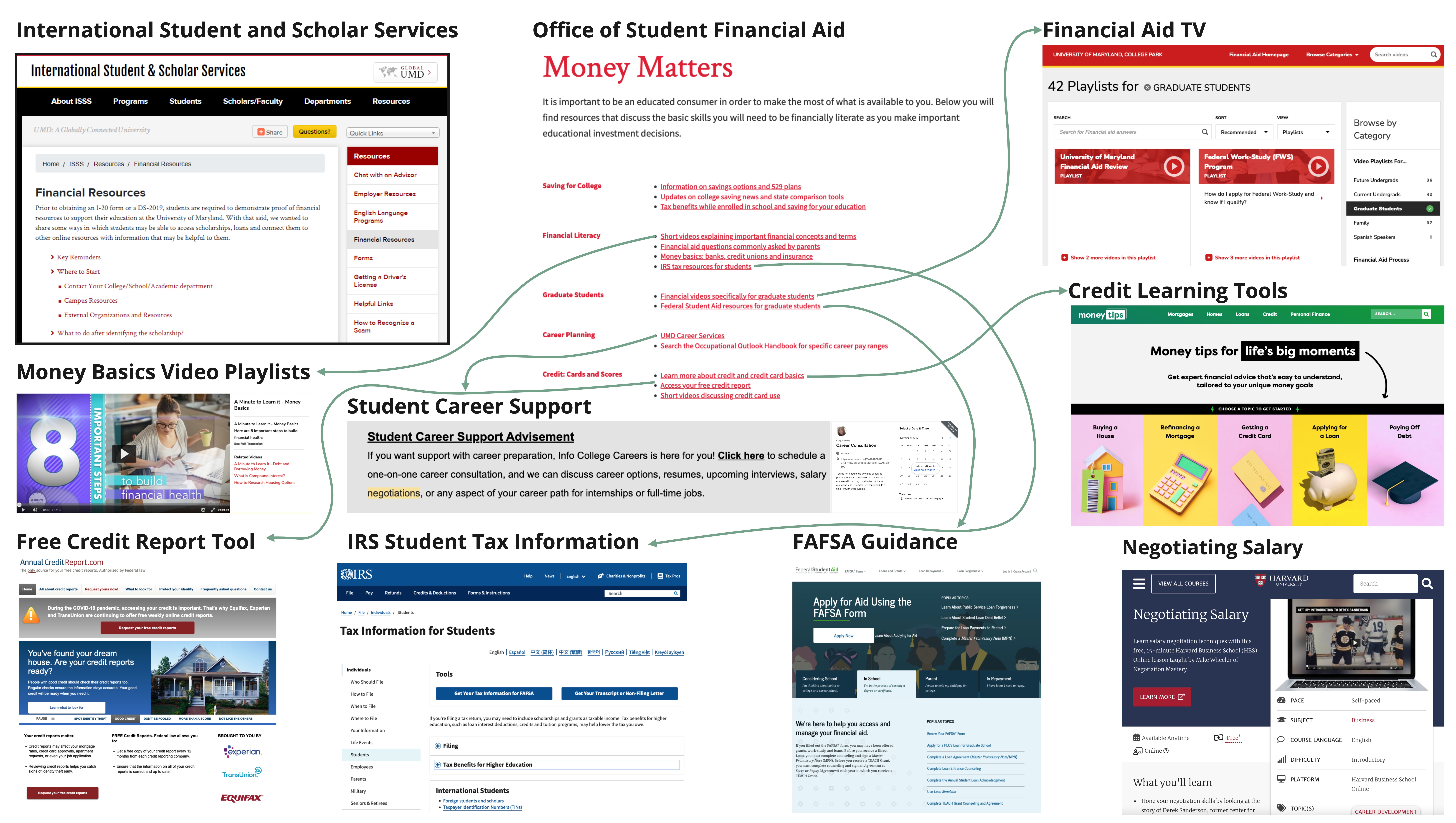
Financial resources and support that the university can provide
This board showed that there are many resources in the university, but they are distributed. And when we asked some international students, many claimed they just heard of some resources. Therefore, our team decided to build a knowledge integration platform for international students.
IDEATION
Hot Ideas & Iterations
Design Principles
Derived from our research findings, I developed the following design principles to guide further design:
![]()

Hot Ideas List
Our team generated possible design ideas through brainstorm and decided on one of them for the further development:


The platform will be a combination of a resources integration section and a question board:
Section 1: Resources Integration
A section that integrates all trusted resources and presents them in a simple way.
A section that integrates all trusted resources and presents them in a simple way.
Section 2: Question Board
A board where users can ask questions about their experiences and receive useful answers.
A board where users can ask questions about their experiences and receive useful answers.
Product Visions
Based on our ideas and questions, we produced several product visions. Then we evaluated all visions and sifted the viable features:
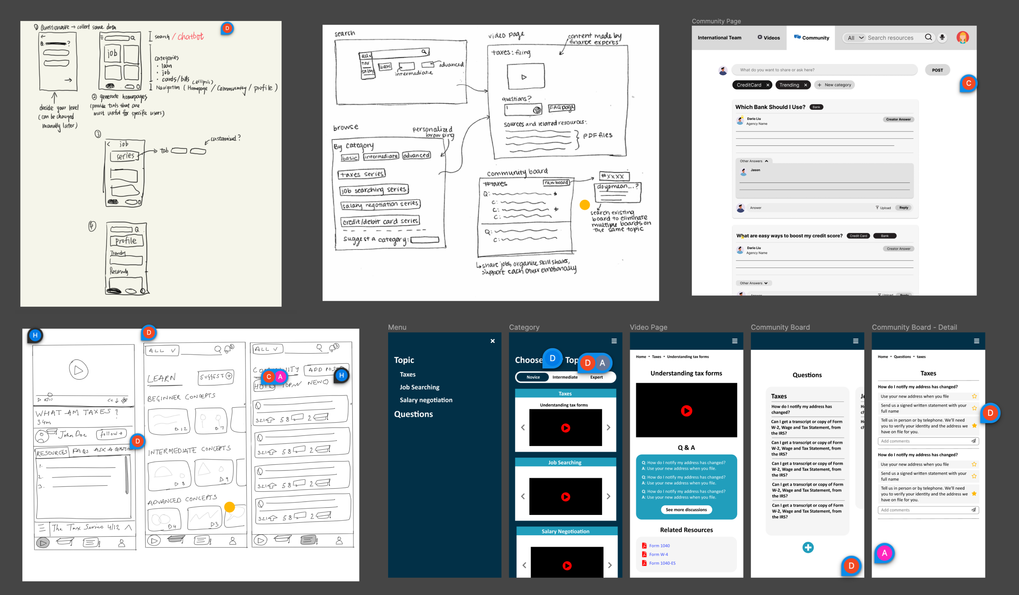
Sharing and evaluation of product visions
Considering the time constraints, I prioritized all the viable features to ensure all main problems could be addressed in the final solution:

FRAMEWORK
Flows & Information Architecture
User Flow
Combined with user research, I assumed that users would use our product for 2 reasons:
![]()
It is clear that the search function should have a high priority on Homepage, and entrance to Question Board should be conspicuous. Besides, it is better to create categories (like Recommendations) on Homepage.

It is clear that the search function should have a high priority on Homepage, and entrance to Question Board should be conspicuous. Besides, it is better to create categories (like Recommendations) on Homepage.

Users may want to view some relevant resources after finishing the course, thus the related information should be presented with the course.
Information Architecture
With the user flow, I built the information architecture to explain where these functionalities would be developed:
![]()
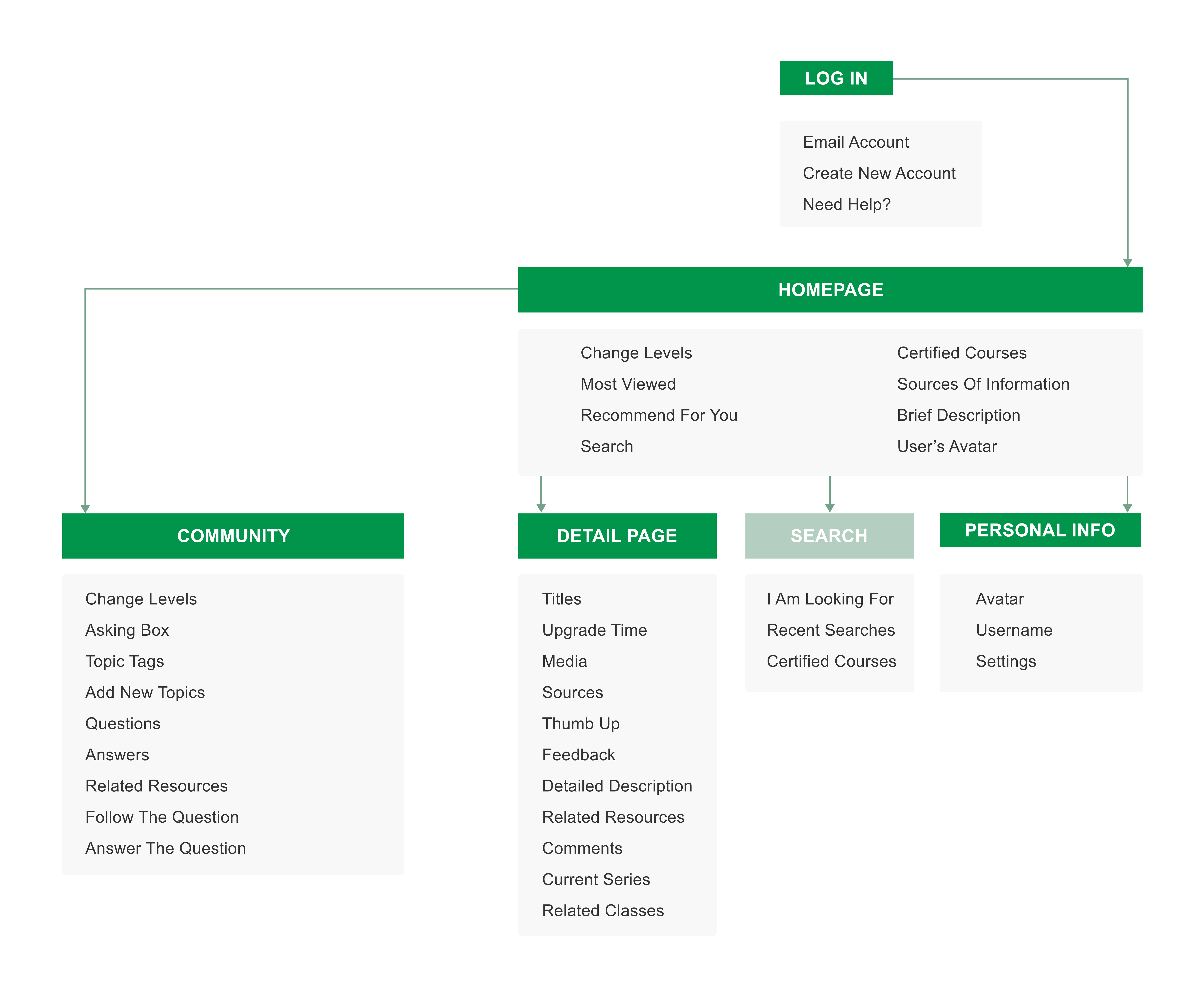
Design
VISUAL
Visual Design & High-fidelity Iterations
Visual Language
I designed a visual system for the product. Visual design aims to present an attractive platform for university students and make sure that the product can express the feelings we mentioned on the sensation board.
![]()
![]()
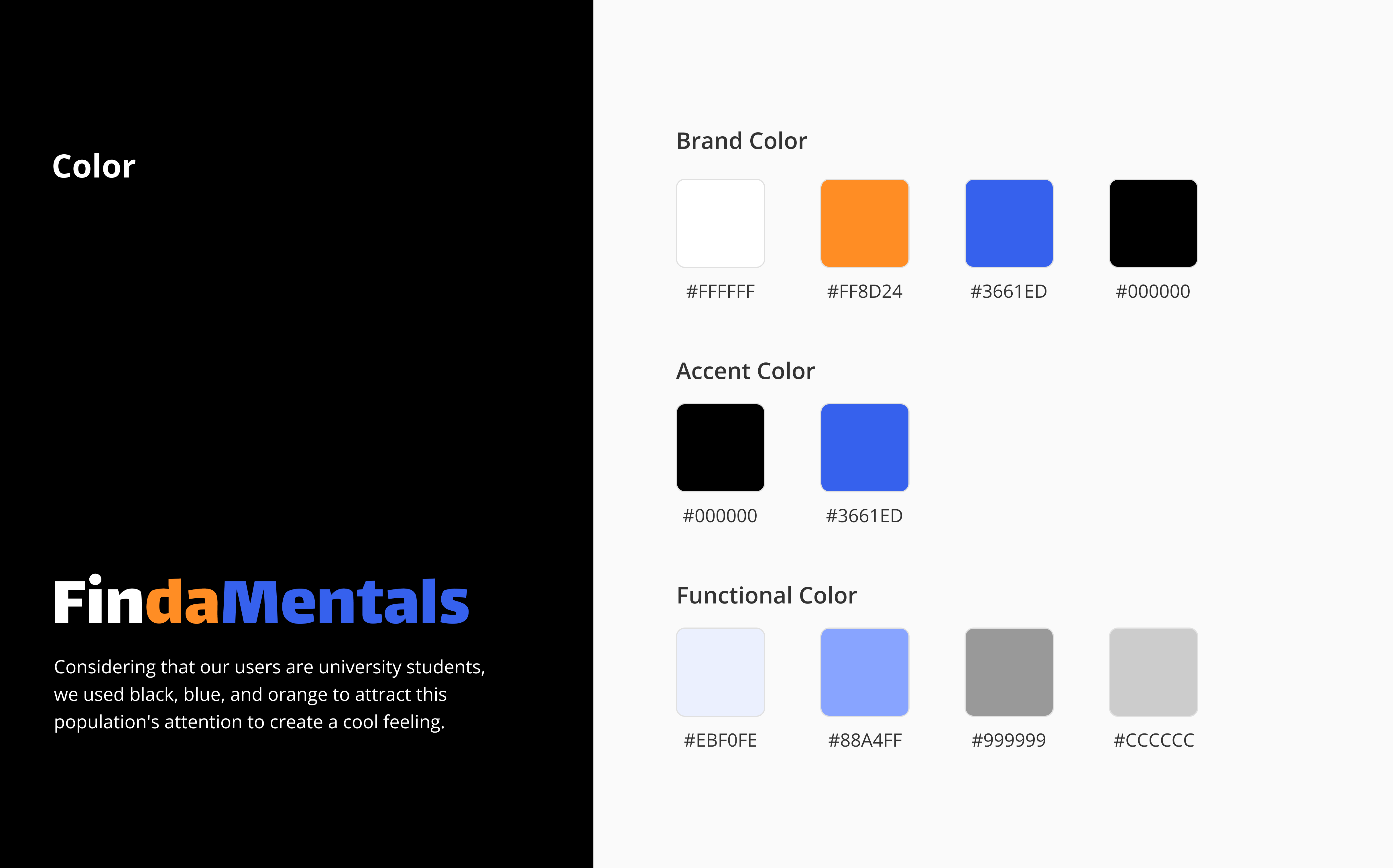
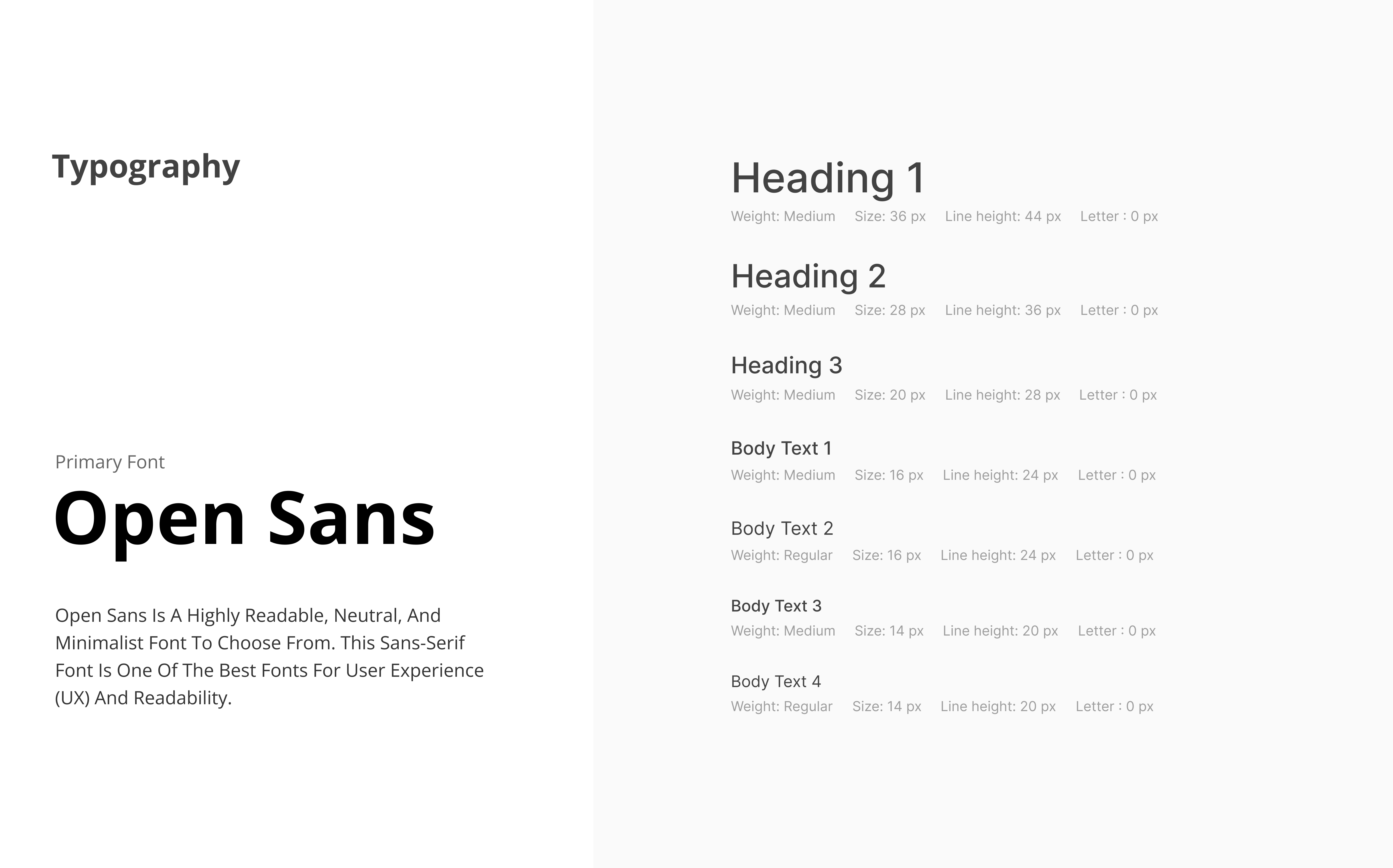
Slide to see more
Due to time constraints, I did not design the whole vision system. Instead, I used an open Ui kit from the Figma community (considering that this version of the interface will not be used for commercial purposes).
Prototyping Iterations
After deciding on the visual language, our team worked together to create low-fi interfaces and the first version of our high-fidelity prototype:
Low-fidelity mockups
![]()
![]()
![]()
The 1st version of the high-fidelity prototypes
![]()
![]()
![]()
Then, we displayed this version to our client and classmates through the wall walk, and we received feedback and suggestions from them:
Low-fidelity mockups
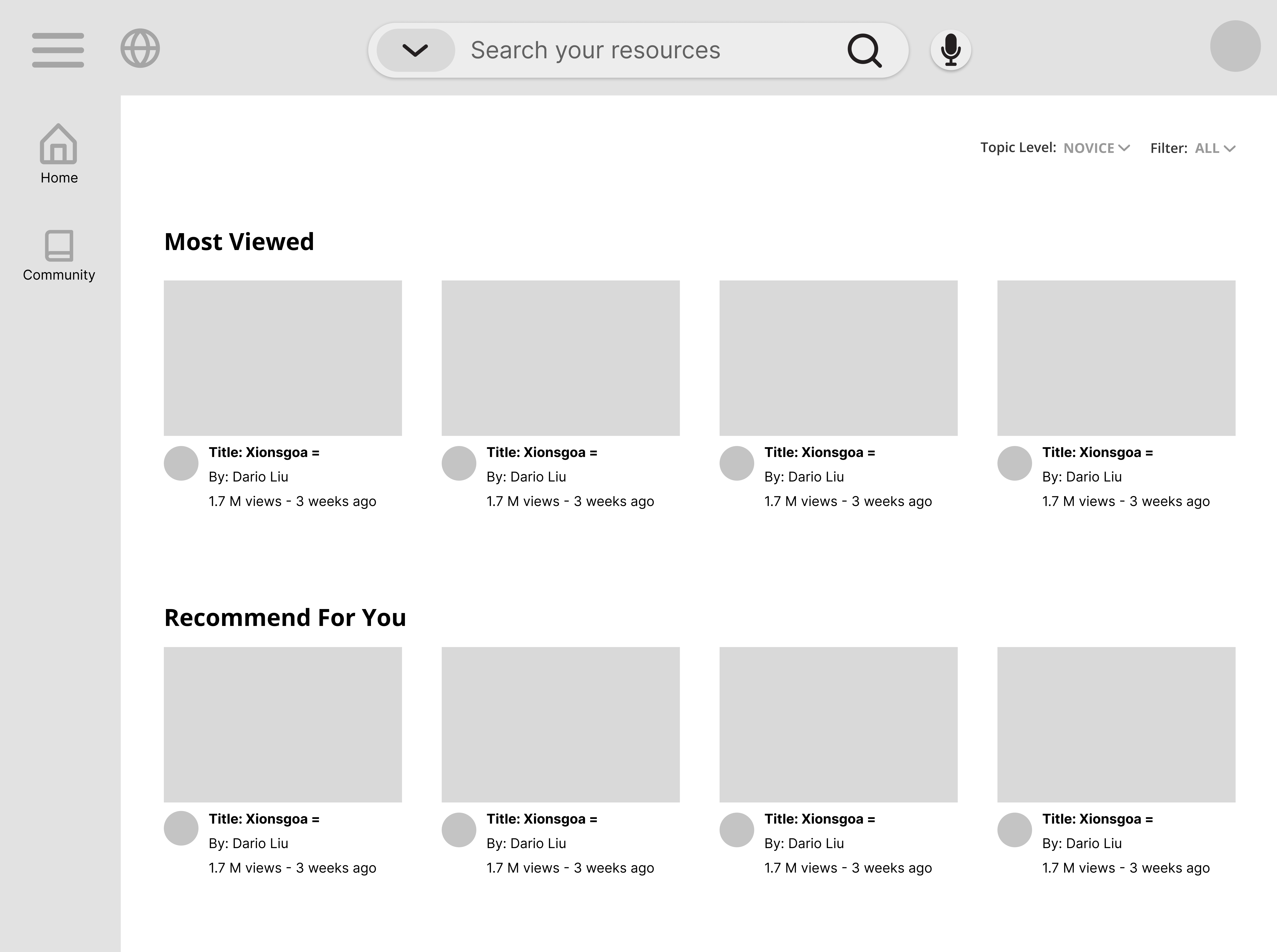
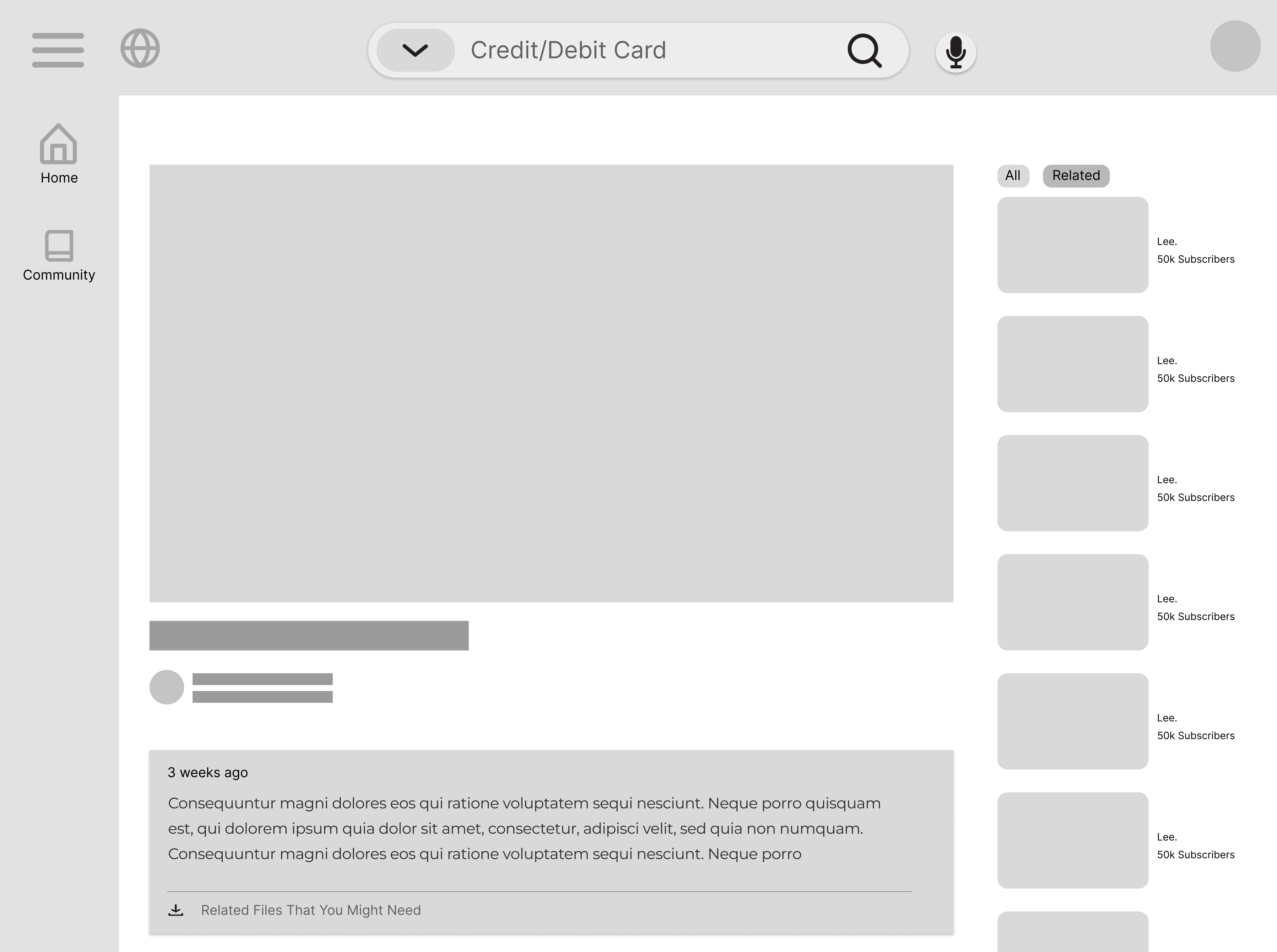
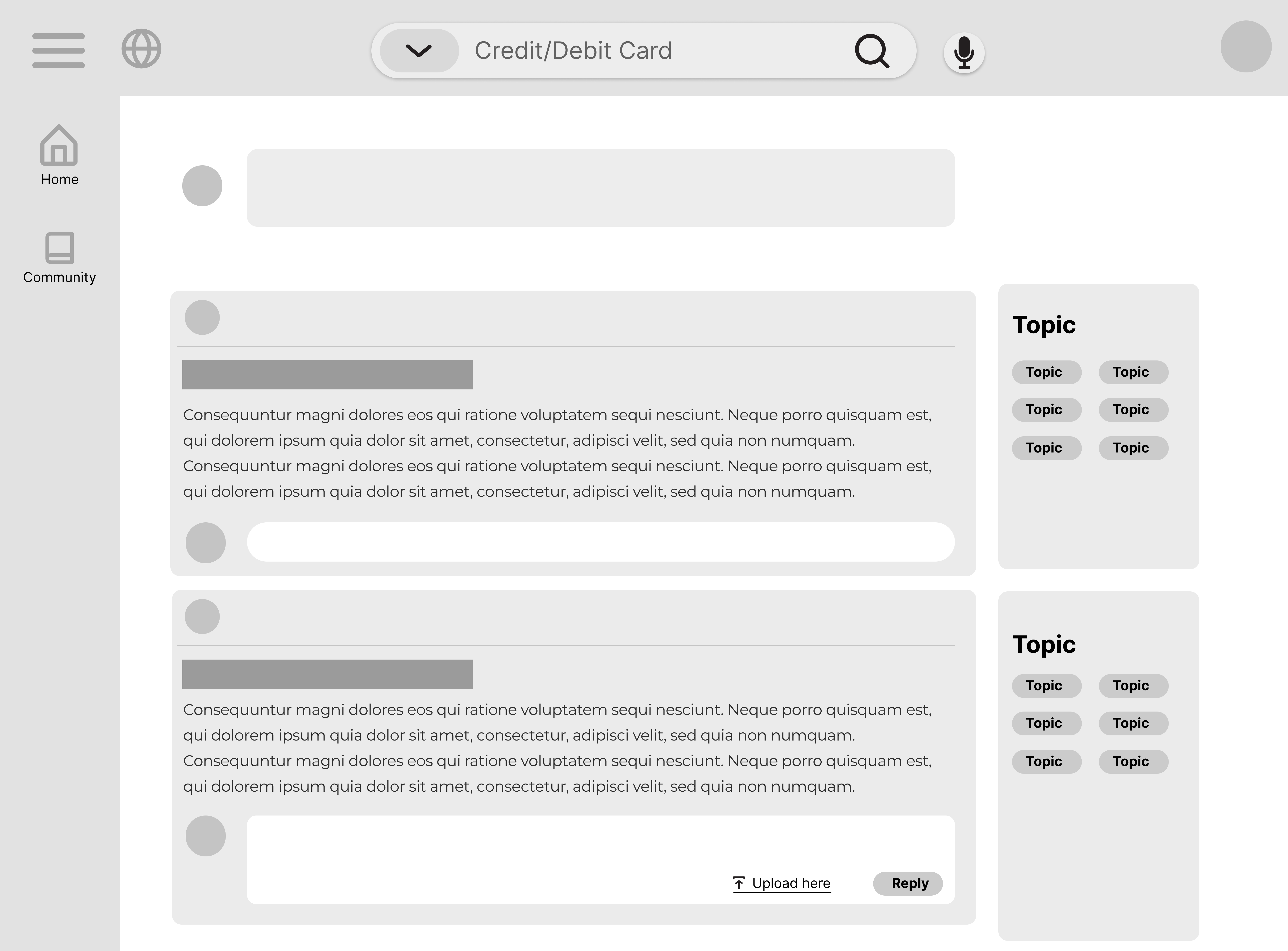
The 1st version of the high-fidelity prototypes
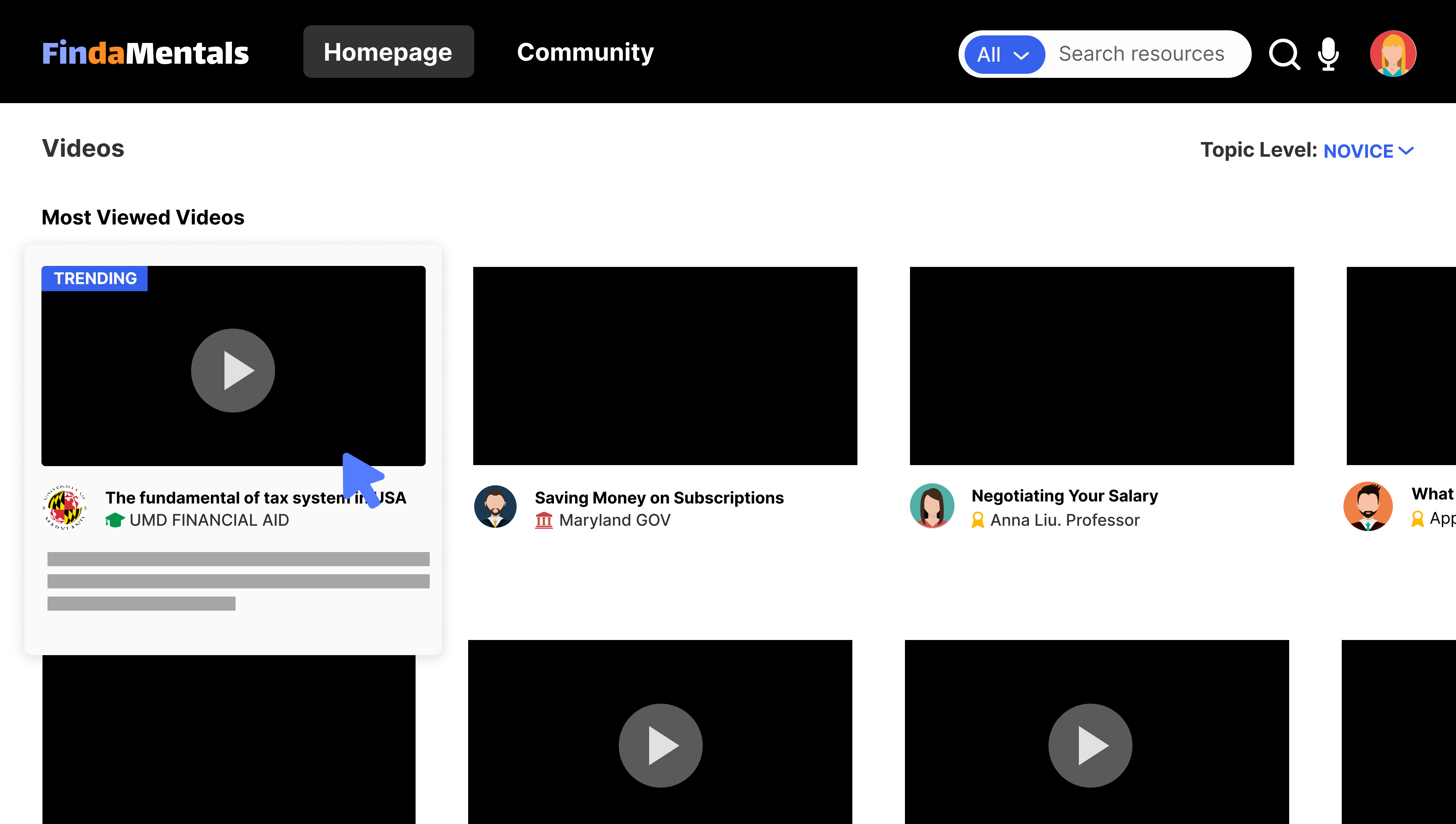

Then, we displayed this version to our client and classmates through the wall walk, and we received feedback and suggestions from them:
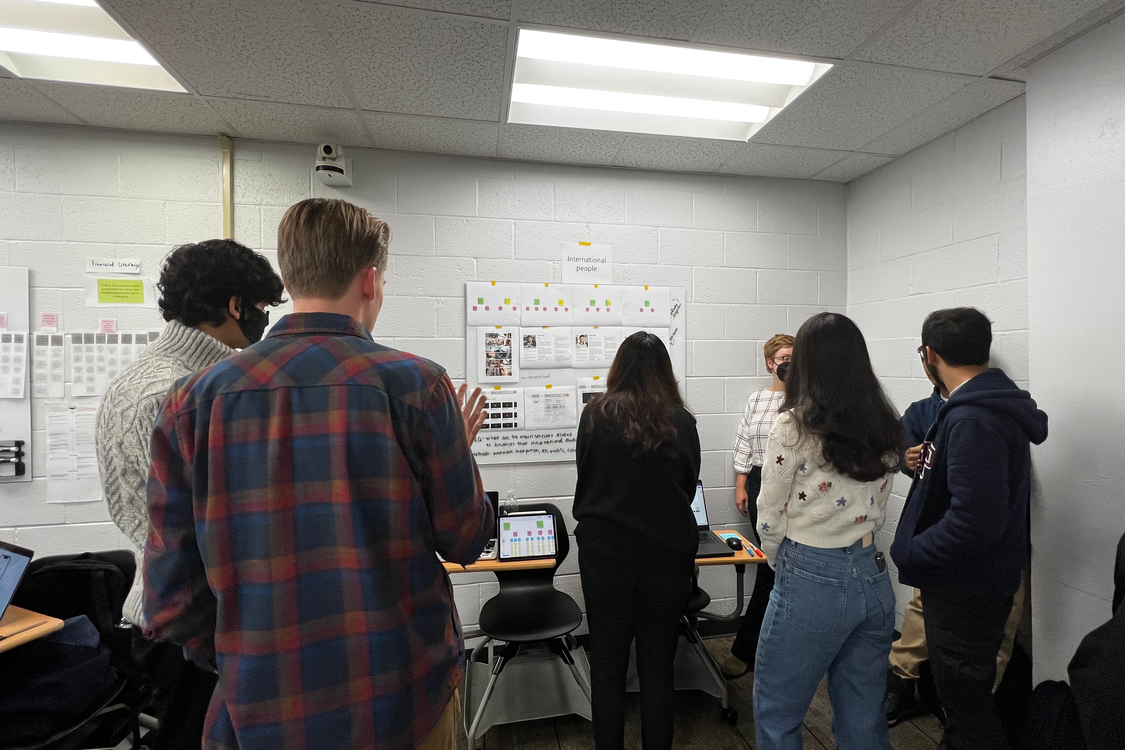


Based on these issues, I iterated our information architecture and prototypes:
Iteration 01: Connections & Specific needs
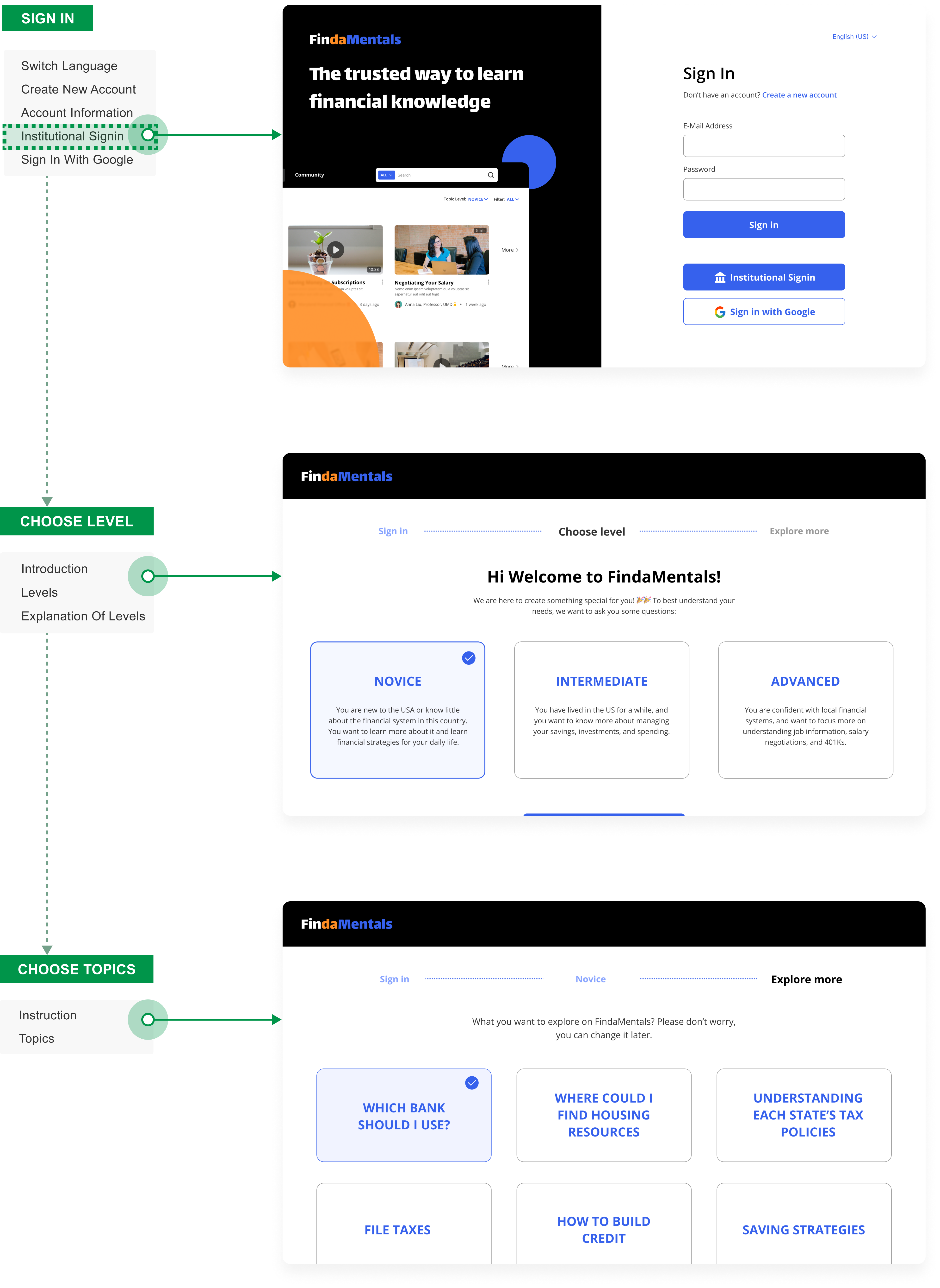
Users can choose the "Institutional signin" option on the sign-in page and use their university account. The website will then prioritize the resources related to the university for users.
![]()

If you were a UMD student, the site would present more resources provided by UMD
Iteration 02: Differentiation
Since FindaMentals is an integration platform that includes videos, articles, and other media formats, we must distinguish it from YouTube. The initial version failed for 2 reasons:
Based on these considerations, I optimized the design:
![]()
- The layout of the cards on the homepage was very dense, like YouTube. And this layout design also violated the simple design principle.
- Although the site has many kinds of resources, they had the same appearance.
Based on these considerations, I optimized the design:
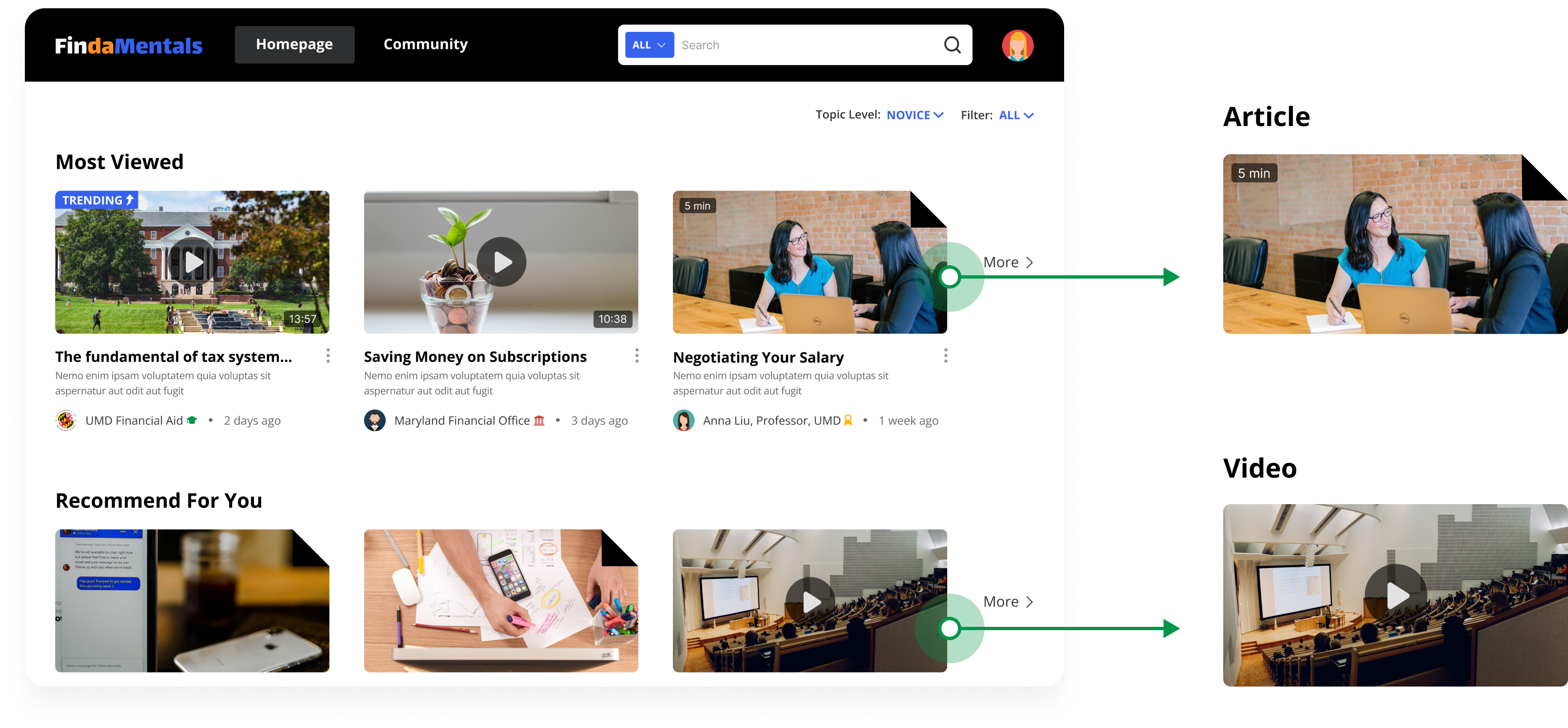
Simplifized the layout and designed different styles for various media
SOLUTION
Final Version
Feature 1 | Diversion
Based on the design principle of Personalized, we designed a divided sign-in process. The platform categorizes users according to 3 filters: Institutions (optional), Knowledge Level, and Topics of Interest, and then presents the most appropriate page to users based on the results.
Feature 2 | Trusted Sources
To increase the credibility of the platform's resources, I have marked the source at the bottom of the thumbnails. Sources are currently divided into 3 main categories:
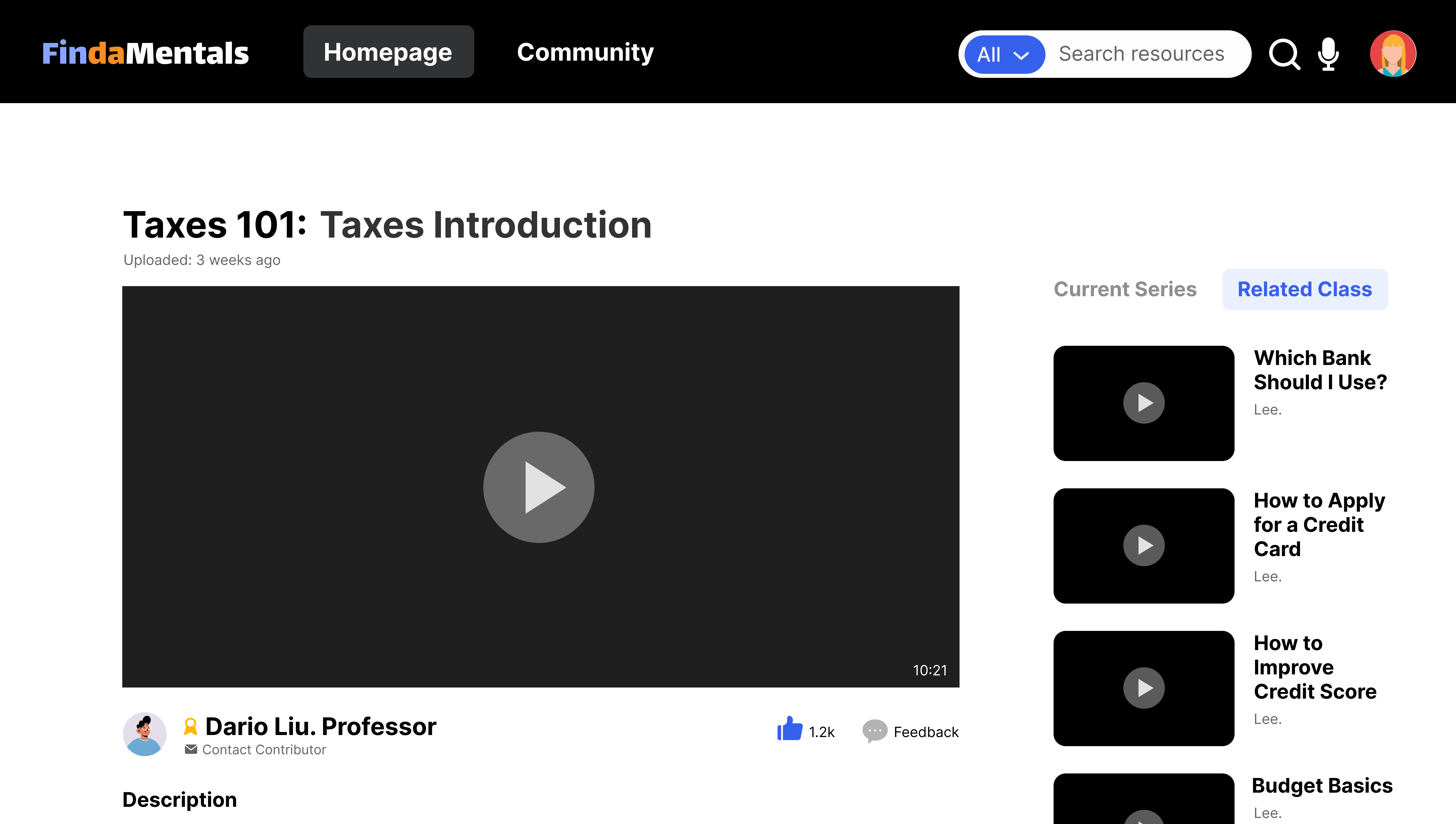
![]()
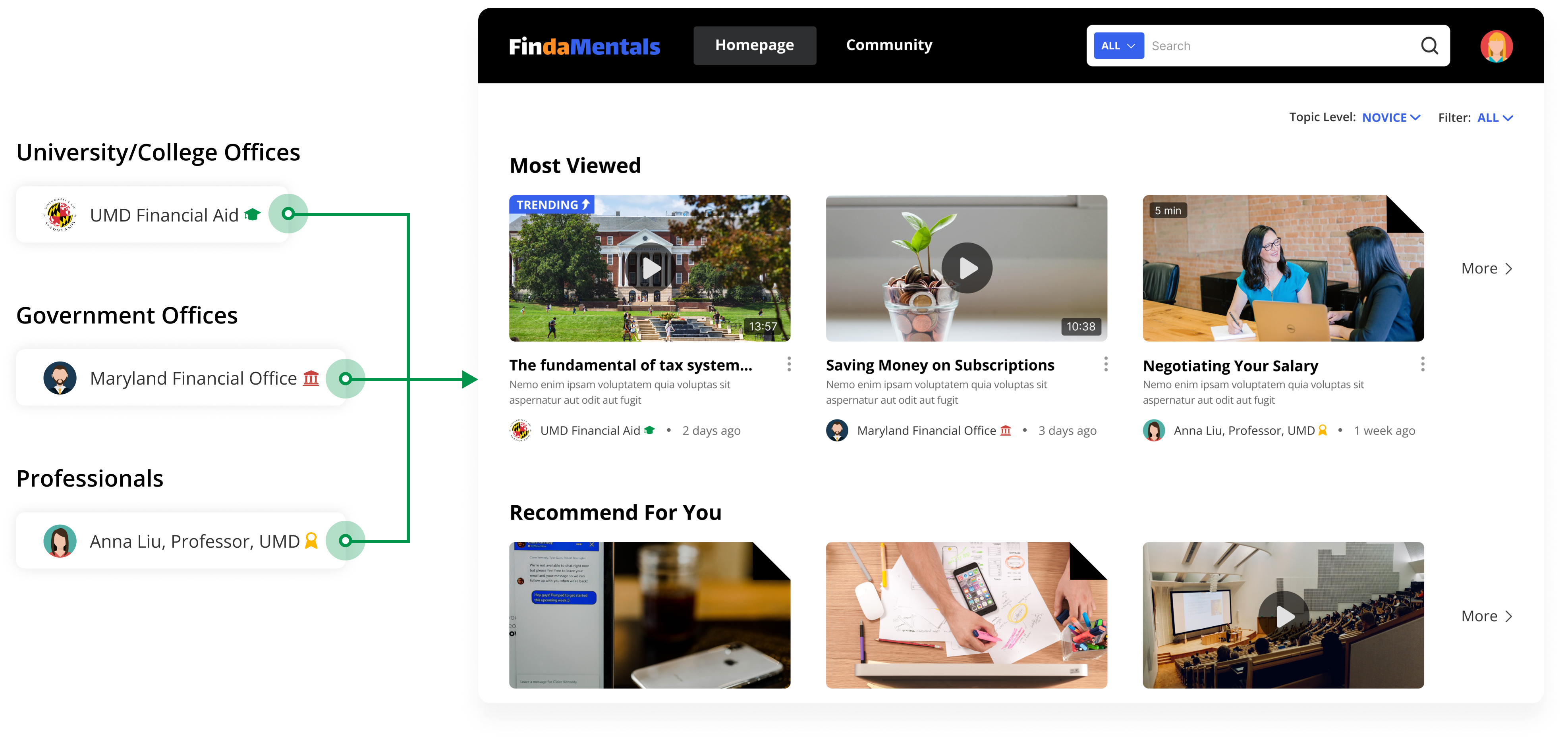
Feature 3 | Guidances
We wanted to set a long-term goal for our product that it would be a search tool and a learning tool. So on the page, we designed some guided learning tools, hoping that this will help users to improve their financial knowledge.
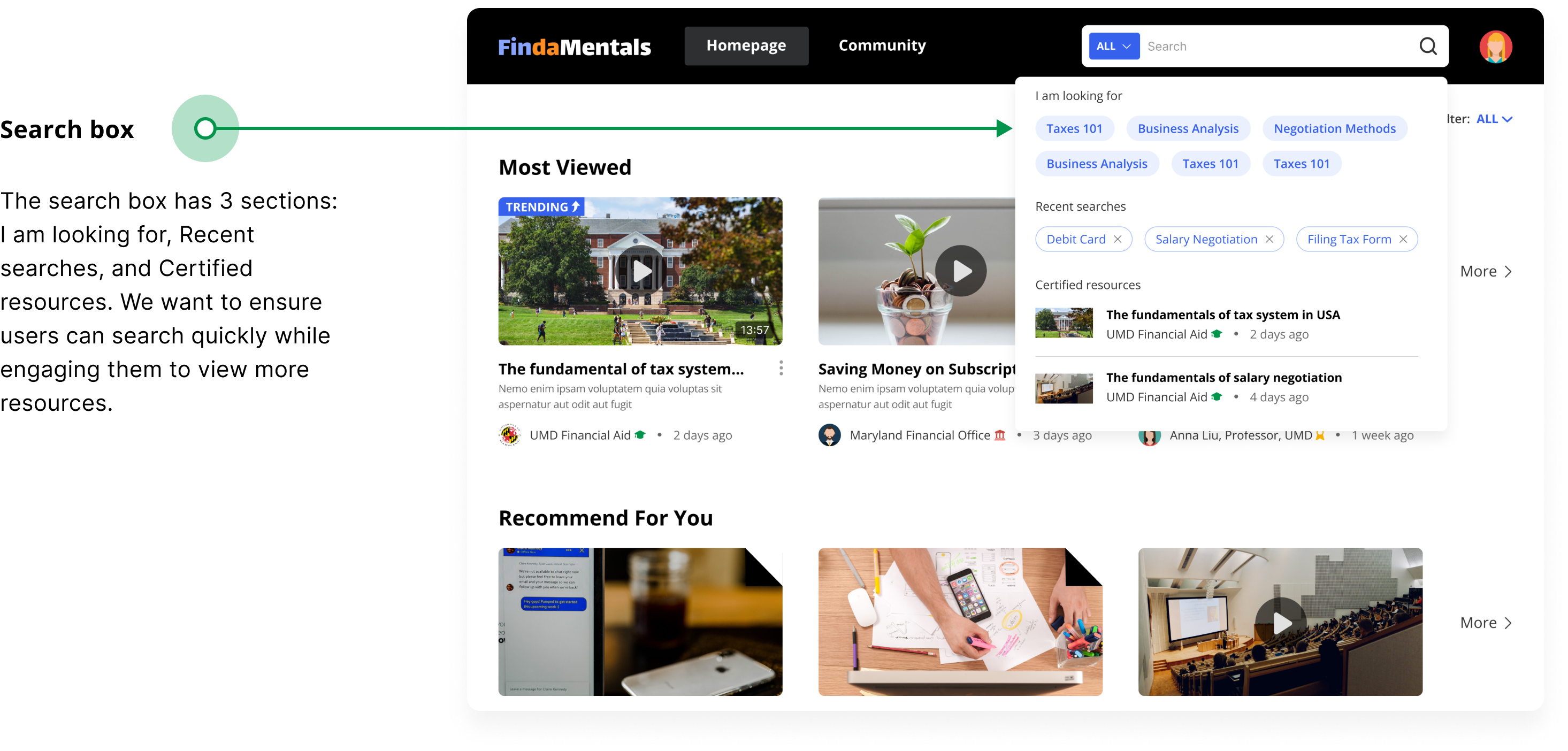
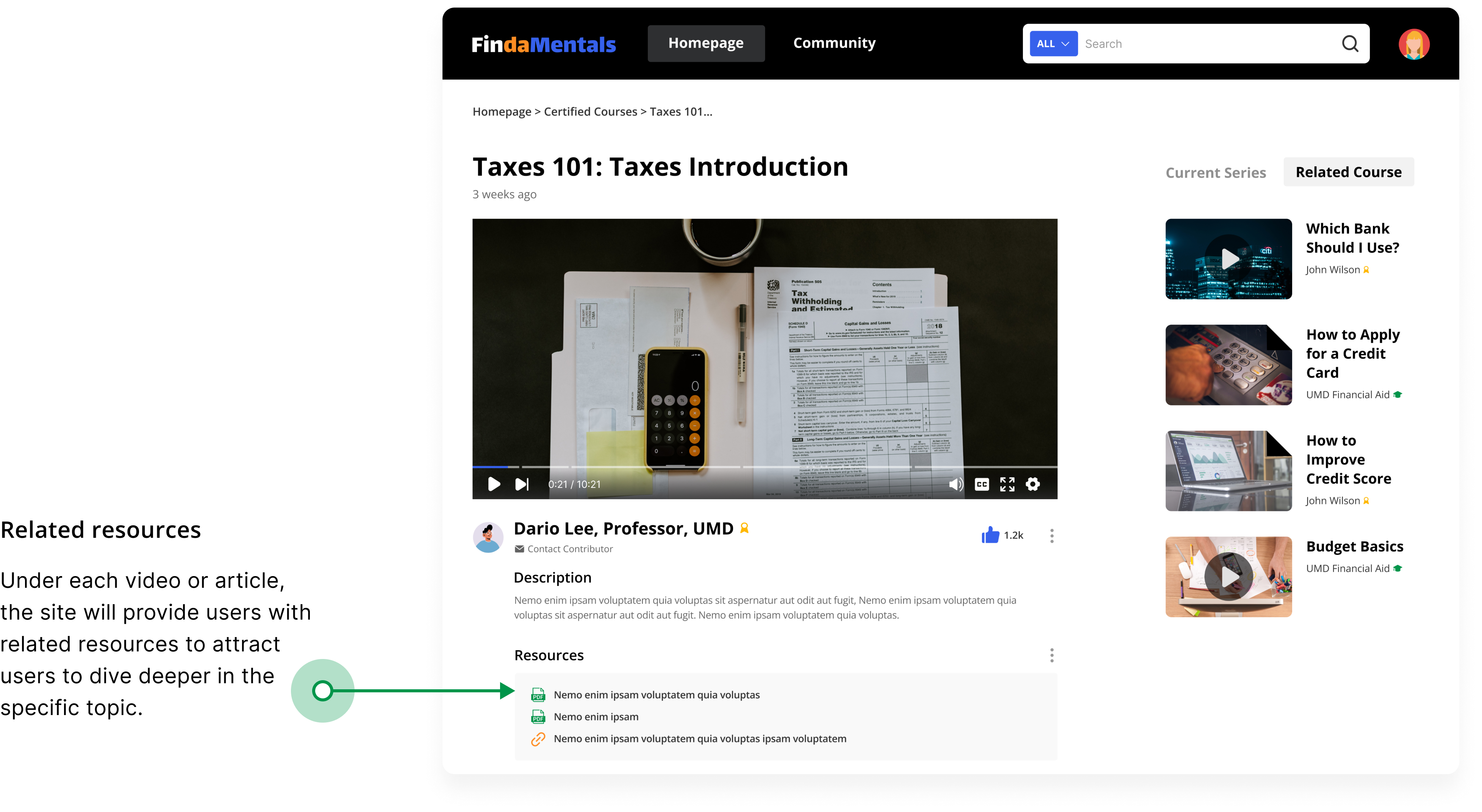
Feature 4 | Real experience & Trusted answers
The community allows users to share their real experiences, and these real-life experiences will provide users with strong emotional support. Besides, to improve the quality, answers posted by certified users will be prioritized.
![]()

Reflection
This is the first user research project I did in HCIM@UMD. In the project, I learned from my previous experience in the internship project and managed the project schedule by prioritizing the project content to complete this task effectively. In the end, our group received the highest marks. The project was also used as an example to share with the class.
Reasonable collaboration and communication
When doing the user research, we worked in pairs. And the results of a pair's study are reviewed by other members in the group meetings. This collaborative approach ensures a more efficient workflow while improving the comprehensiveness of insights.
Product iteration based on feedback
We conducted 2 rounds of wall walks and 2 project progress presentations during the project. These events helped us gain valuable feedback from the client and helped us improve the product concept.
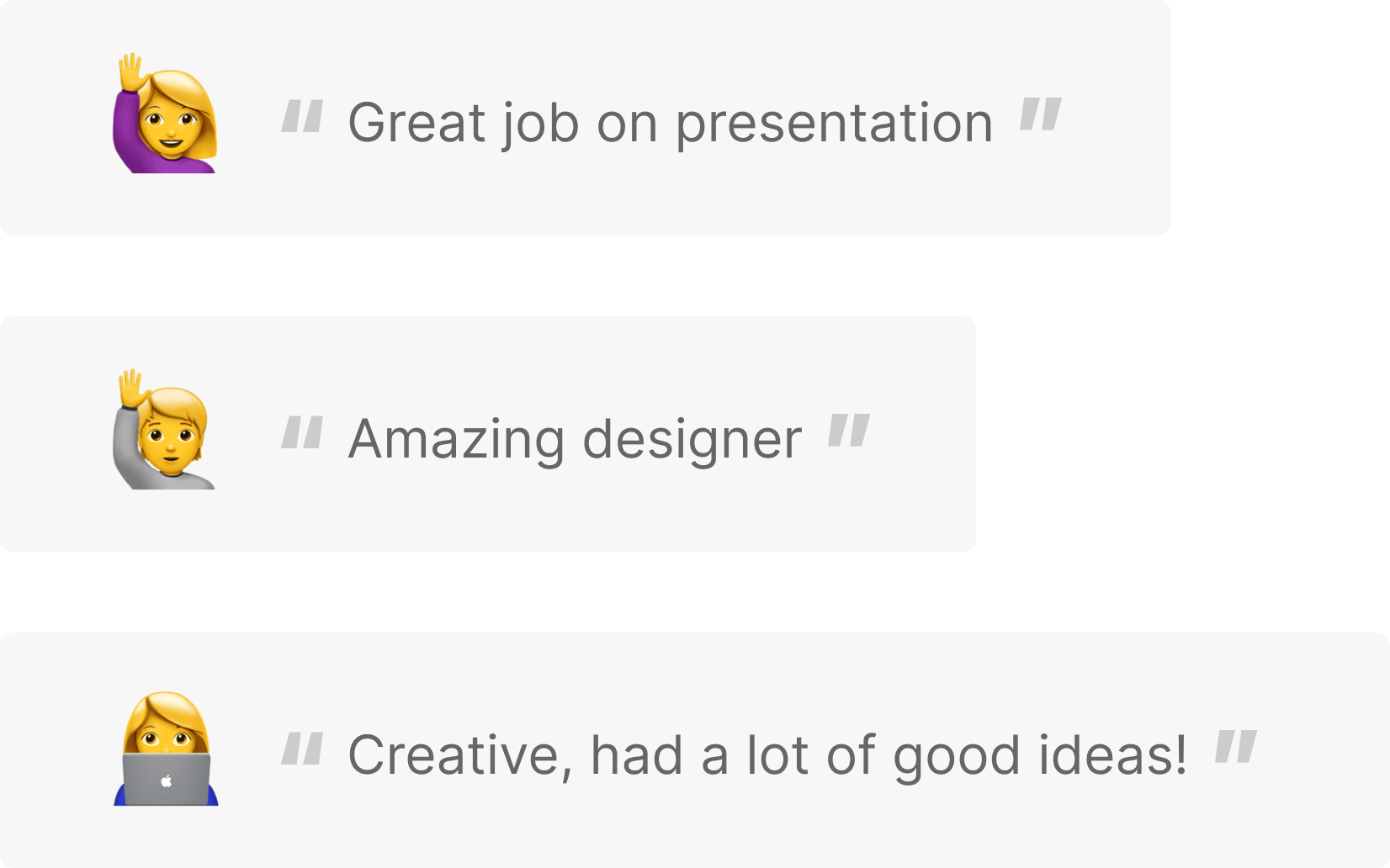
I am happy to be able to design with people from different backgrounds. We learn from each other and grow together. I was in charge of user research, concept iterations, and visual design in the project. And my work was appreciated by group members in the final peer review:
BACK TO TOP
